

Building a Home Assistant Dashboard People Actually Use
The default Home Assistant dashboard lists everything you own. That is exactly why nobody uses it. A dashboard people actually open is opinionated: it answers the three questions your household asks every day — is the house secure, is anyone home, and what needs my attention — in under five seconds, and it puts every common action within one tap. This guide builds that dashboard, room by room, without custom code to start.
Published Nov 17, 2026 · Last updated Nov 18, 2026
Start from a hard truth: if a control takes three taps, people will walk to the physical switch instead, and they will be right to do so. Your dashboard has to beat the wall switch on speed for the things people do daily, and beat opening five separate apps for everything else.
What you need
- A Home Assistant instance with your main devices already integrated and named sensibly — fix entity names before you design around them.
- Thirty minutes of observation — note which controls your household actually uses for a few days. Build for that list, not for every device you own.
- The built-in dashboard editor — everything in this guide uses stock cards first. Community cards are an upgrade later, not a prerequisite.
- One test audience — another person in the house who will tell you honestly when something is hard to find.
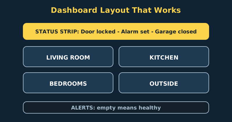
Step-by-step: build the dashboard
- Create a new dashboard and leave the default one alone. Go to Settings, then Dashboards, and add a new dashboard for daily use. Keeping the auto-generated overview intact gives you a free “everything” reference for troubleshooting, while your new dashboard stays clean. Set the new one as your own default once it is ready — note that the default dashboard is a per-account setting, so each household member picks their own; setting yours does not automatically change what anyone else sees.
- Build a status strip at the top of the first view. The first screenful should answer questions without tapping: front door locked or unlocked, alarm state, garage open or closed, anyone home, and the current temperature inside and out. Use a horizontal stack of small entity or tile cards. If everything is normal, this strip is boring — that is the point. Boring means secure.
- Organise by room, not by device type. People think “kitchen lights”, not “all Zigbee bulbs”. Create one view or one clearly headed section per main room, in the order people move through the house: entry, living room, kitchen, bedrooms, outside. Within each room, order controls by frequency of use, lights first in most homes, then climate, then media, then the rarely touched settings.
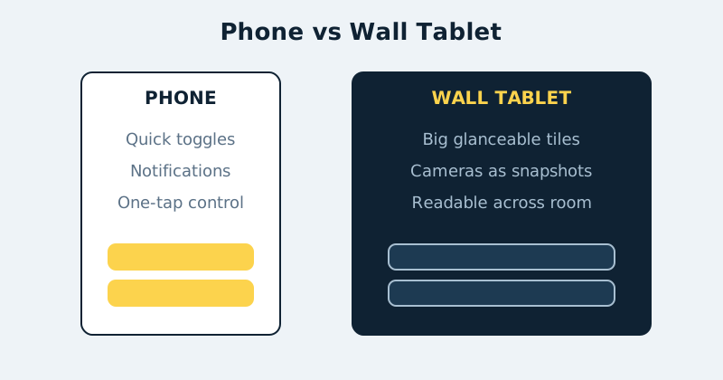
- Use tile cards for the controls people tap. Tile cards are large, touch-friendly and show state at a glance, which makes them ideal for phones and wall tablets. Reserve dense entity lists for a separate “details” view. Add tap actions deliberately: a tap should toggle the thing people expect, while a hold can open the detailed controls such as brightness or colour.
- Add an alerts section that is empty most of the time. Use a conditional card or a filtered entities view that only appears when something is wrong: a leak sensor wet, a door left open, a battery below 15 percent, or a device unavailable. An alerts area that always shows something trains people to ignore it. Empty means healthy, and everyone in the house learns that in a day.
- Make separate views for phone and wall panel if their jobs differ. A wall panel in the kitchen wants cameras, timers, a shopping list and big buttons readable from across the room. A phone wants quick toggles and notifications. Home Assistant lets you control card and view visibility per device and user, and a dedicated kiosk user with its own default dashboard keeps the panel simple and locked to its job.
- Add cameras as pictures, not streams. Use picture entity cards that show a recent snapshot and only load the live stream on tap. A grid of live streams slows the dashboard, drains tablet batteries and makes the first view feel chaotic. Snapshots answer “is everything fine outside?” instantly; the tap is there when something looks wrong.
- Test with real tasks, timed. Ask your test audience to do five things: turn off all the downstairs lights, check if the garage is closed, set the thermostat for the night, see who is home, and find the front door camera. Watch where they hesitate. Every hesitation is a labelling or ordering problem you can fix in two minutes — and it is far cheaper to find now than after the dashboard is “finished”.
A starter layout in YAML
If you prefer editing YAML, or want to version-control your dashboard, here is the layout above reduced to a minimal starter skeleton — a status strip, one room grid and a camera snapshot. It is deliberately not the full multi-view layout described in the prose; treat it as the frame you build out room by room. Adapt the entity IDs to your own system:
title: Home
views:
  - title: Overview
    path: overview
    cards:
      - type: horizontal-stack
        cards:
          - type: tile
            entity: lock.front_door
            name: Front door
          - type: tile
            entity: cover.garage_door
            name: Garage
          - type: tile
            entity: alarm_control_panel.home_alarm
            name: Alarm
      - type: grid
        columns: 2
        cards:
          - type: tile
            entity: light.living_room
            name: Living room
          - type: tile
            entity: light.kitchen
            name: Kitchen
          - type: tile
            entity: climate.main_thermostat
            name: Heating & cooling
          - type: picture-entity
            entity: camera.front_door
            name: Front door camera
            camera_view: snapshot
            show_state: false
One phone caveat on that two-column grid: two columns of tiles can feel cramped on a smaller phone, especially wide cards like the camera. Test the view on your phone before rolling it out to the household — drop to a single column for the wide cards, or give phones their own view with a layout designed for one thumb.
Design rules that keep it usable
Names are interface. “Living Room Lamp” beats a model number every time, and consistent naming — room first, then device — makes voice control and search work better too. Colour means state, not decoration. If amber means “on” for lights, do not also use it decoratively elsewhere. Hide the plumbing. Batteries, signal strength, firmware and diagnostic entities belong on a maintenance view, not next to the light switches. Finally, review quarterly: devices change, habits change, and a ten-minute tidy keeps the dashboard matched to the house instead of to the house as it was a year ago.
Common mistakes and troubleshooting
- Putting every entity on the first view. The dashboard becomes a parts catalogue. If a control is used less than weekly, it belongs on a room detail view, not the home screen.
- Cards in different places on phone and desktop. Reordering between devices confuses muscle memory. Keep the order identical and let the layout reflow naturally.
- Dashboard is slow to load. Usually live camera streams or huge history graphs. Switch cameras to snapshots, shorten graph ranges, and split rarely used heavy cards onto their own view.
- Nobody else in the house uses it. Almost always a findability problem, not a training problem. Run the timed-task test, fix the two worst hesitations, and set your dashboard as their account default.
- Wall tablet keeps logging out or dimming wrongly. Use a dedicated kiosk user, keep the device plugged in, and use the official app's kiosk-friendly settings rather than a browser tab that reloads and loses its session.
Official documentation and references
- Home Assistant documentation — dashboards overview and concepts
- Home Assistant documentation — dashboard views and layout options
- Home Assistant documentation — the full card reference
FAQ
Should I use the visual editor or YAML mode?
Start with the visual editor — it is faster to learn and harder to break. Move a dashboard to YAML when you want backups, version control, or precise repetition of a card pattern across many rooms. Many households run a hybrid: visual editing day to day, with a YAML copy kept in a backup.
Do I need custom cards from the community store?
No. Stock cards cover the design in this guide completely. Add community cards later for a specific job the stock cards do badly — a better thermostat dial, a compact media card — one at a time, so you can tell which addition helped and which just added clutter and update risk.
How many views should a dashboard have?
For most homes, three to six: an overview, a few room or floor views, a cameras view, and a maintenance view. If you need a labelled map to find a view, you have too many. Search and the overview status strip should handle the rest.